The system behind the spark.
The wordmark, the color system, the Geist type scale, and the voice that keep sparx coherent across thirteen modules, a dozen domains, and every surface a tenant touches. This page is the source of truth — for us, and for anyone building with the sparx brand.
- Platform
- sparx
- Company
- WizeWorks, Inc.
- Primary domain
- sparx.works
- Maintained by
- [email protected]
The wordmark. The “x” always sparks.
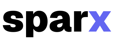
Lowercase sparx, with one detail doing the work: the “x” carries sparx Indigo — the instant of ignition the brand is named for. The outlined lockup is the canonical artwork; the live UI renders the same wordmark in the interface font.
Construction
- Lettercase
- lowercase — sparx
- The “x”
- Tracking
- Minimum size
- 16px tall
- Source
- sparx-wordmark.svg
Clear space & minimum size
The dashed frame marks the minimum clear space — the height of the “x” on all sides. Below 16px tall the “x” loses its color contrast; switch to the monogram mark instead.
One-color variants
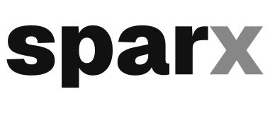
For print, photography, or any surface where the indigo can’t sit, use the one-color lockup. The “x” stays legible by dropping to 50% opacity instead of changing hue.

Size ladder
20px tall28px tall40px tall56px tall- The wordmark is all-lowercase — “sparx”, never “Sparx”. The leading “s” is not capitalized.
- On color surfaces the “x” is always sparx Indigo, never neutral.
- Need one color? Use the black or white variant — the “x” stays distinct at 50% opacity.
- Never set the wordmark below 16px tall.
- Keep clear space equal to the height of the “x” on every side.
- Don’t re-letter, condense, or substitute the letterforms — use an official asset.
The monogram mark.
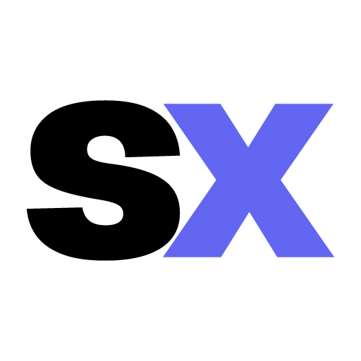
When the full wordmark won’t fit, the “sx” monogram stands in. The “s” adopts the current text color so it flips between light and dark surfaces; the “x” stays sparx Indigo, carrying the same brand moment as the wordmark.
Anatomy
- The “s”
- The “x”
- Source
In product UI it renders via <SparxMark> from @sparx/ui. As a favicon — where CSS variables can’t resolve — each app ships a static app/icon.svg that inlines the hex plus a prefers-color-scheme rule.
When to use it
- Favicons and browser tabs
- App icons and PWA install tiles
- Square avatars and social profile marks
- Anywhere the full wordmark would fall below 16px
What not to do with the mark.
The wordmark earns its clarity from restraint. These are the treatments that break it — each one undoes the single detail the brand is built on.
sparx Indigo.
One brand color carries the platform. It is the “x” in the wordmark, the foundation module’s identity, and the default accent on every sparx surface — the spark, made into a hex.
Fourteen modules. One color each.
Every module owns a single hue, and it surfaces identically in three places: the module’s marketing site, its nav item in the dashboard, and a soft color-mix wash on its cards. One softly-tinted card per module tells a tenant where they are — quiet wayfinding, no loud stripe and no label required.
The AI / MCP exception
Rose stays reserved for AI / MCP even though the palette has since grown to cover the full spectrum. Every other AI product reached for purple, teal, or blue; rose is unused in B2B SaaS AI branding and signals “different in kind” — the module that thinks, not just functions. sparx Indigo + Rose is near-complementary, so it reads as hierarchy.
When a module color is also a semantic hue
Inventory’s Amber is the warning hue, so inside Inventory, stock alerts use danger/red to stay distinct from the module chrome. On a solid Amber or Yellow fill (Inventory, SEO), text and icons use dark ink — white fails AA. Warning, danger, and success keep their meaning on every surface, in every module.
Semantic & neutral palette.
Three semantic colors mean the same thing on every surface and are never used as decoration. The neutrals are a single base ramp — near-white and near-black, never the real thing — where each token resolves to its own value in light and dark. Supporting and hint text aren’t separate colors; they’re that same ink dialed back to 70% and 50% (text-base-content/70 and /50).
Semantic — reserved, never decorative
Neutrals — light mode
Neutrals — dark mode
Neither pure white nor pure black — near-white and near-black backgrounds feel intentional in both modes, never like an inverted screenshot.
Geist, doing the heavy lifting.
Geist is Vercel’s open-source interface typeface — geometric precision with editorial warmth. Hierarchy comes from size and spacing, never from heavy weights.
Two weights only
Fallback stack
Six principles that hold it together.
The brand is a set of decisions as much as a set of colors. These are the rules that make a sparx surface feel like sparx, whatever module you’re in.
Flat by default
No gradients, drop shadows, or blur — except a functional focus ring. Depth comes from border contrast, never from elevation.
Minimal chrome
The UI gets out of the way of the tenant’s work. Navigation is always visible but never dominant. Empty states are helpful, not decorative.
One tinted card per module
A module’s color surfaces as a soft tint on a single lead card per section — a color-mix wash, never a loud stripe. One tinted card is wayfinding; a wall of them is noise, so the rest of the cards stay neutral.
Module isolation
Work inside the CMS and the accents shift to teal; switch to AI and they shift to rose. The color transition reinforces context and makes the system feel coherent.
Progressive disclosure
Advanced features — API keys, webhooks, MCP config, B2B pricing rules — exist but stay hidden from a new tenant. The five-minute path to a live site is always clear.
Mobile-first, always
Every surface works from a 320px phone to a 2560px monitor. Display type uses fluid clamp() scaling; layouts reflow, they never just shrink.
sparx speaks directly.
No hedging, no corporate softness, no “revolutionary” or “game-changing.” Short sentences — subject, verb, done. Second person, present tense. sparx doesn’t explain itself; it demonstrates.
Everything, ignited.
The hero rotates the leading noun through the offerings — each landing on ignited. with the indigo spark. Static form for titles, OG, and social: Everything, ignited.
AI builds it. sparx keeps it.
The durability story, for the era of disposable AI-generated sites. sparx is MCP-native — this is AI plus permanence, never AI versus AI. Easy to create is table stakes now; easy to keep — maintain, enhance, own — is ours.
- Generated in a moment. Built to last.
- Coding optional. Permanence included.
- Your AI can start it. sparx is where it lives.
What sparx is not.
The brand is defined as much by what it refuses. sparx is the tool a senior developer wishes existed — technical enough to be trusted, simple enough for anyone to use.
Take the assets.
The wordmark, monogram, and icon set, ready to drop in. Keep the “x” indigo, keep the clear space, and don’t recolor the letterforms. Need editable source, a one-color variant, or something bespoke? Email [email protected].